Beautiful Emacs
When you spend all day looking at code, it’s important to select a good editor font. Obviously, the font needs to be monospaced or the alignment will be all wrong. Well, there are only a handful of monospaced fonts worth looking at (and Courier is not one of them).
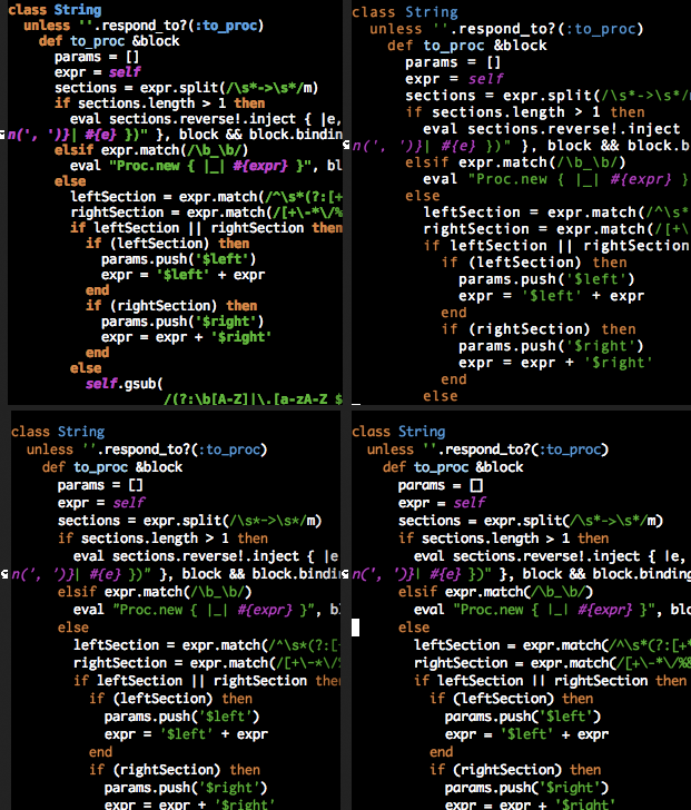
Take a look at the following image. Click on it, and pick your favorite of the four fonts.

These are the fonts in the image, clockwise from the top left corner: Bitstream Vera Sans Mono, Andale Mono, Monaco, and Inconsolata.
Bitstream Vera Sans Mono is my second favorite. It’s the font I use on my web browser. However, for editing code, I find it a bit too heavy. This probably has more to do with my color scheme than the font per se, so your millage might vary.
Andale Mono is very readable, but I find the spacing all wrong and somewhat distracting. Look at the word “String”, the letters seem too far apart.
Inconsolata is my personal favorite. You need to crank up the font size because it seems to be a smaller font than the rest. I thought that point sizes were supposed to be standard, but apparently I was wrong.
Monaco is the default in Mac OS X, but it looks kind of silly. I used to use whatever was the default, so I’ve used this font quite a while. I never did mind it, but once I made the switch to Inconsolata, I can’t stand it anymore.
If you want to play with different fonts in Carbon Emacs, you can
enable mac keys by running the (mac-key-mode) function, and then
pressing ⌘T, which will open a standard font dialog.
However, if you want to use Inconsolata as your default font, put this
in your .emacs
(require 'carbon-font)
(fixed-width-set-default-fontset
       "-apple-inconsolata-medium-r-normal--14-*-*-*-*-*-iso10646-1")
It took me a while to figure out how to change the font on Carbon Emacs, so I hope that even if you don’t choose Inconsolata as your preferred font, this information might prove useful.
 Oscar Bonilla