Visualizing Bayes Theorem
I recently came up with what I think is an intuitive way to explain Bayes’ Theorem. I searched in google for a while and could not find any article that explains it in this particular way.
Of course there’s the wikipedia page, that long article by Yudkowsky, and a bunch of other explanations and tutorials. But none of them have any pictures. So without further ado, and with all the chutzpah I can gather, here goes my explanation.
Probabilities
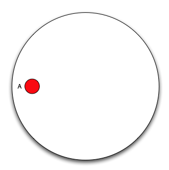
One of the easiest ways to understand probabilities is to think of them in terms of Venn Diagrams. You basically have a Universe with all the possible outcomes (of an experiment for instance), and you are interested in some subset of them, namely some event. Say we are studying cancer, so we observe people and see whether they have cancer or not. If we take as our Universe all people participating in our study, then there are two possible outcomes for any particular individual, either he has cancer or not. We can then split our universe in two events: the event “people with cancer” (designated as \(A\)), and “people with no cancer” (or \(\neg A\)). We could build a diagram like this:
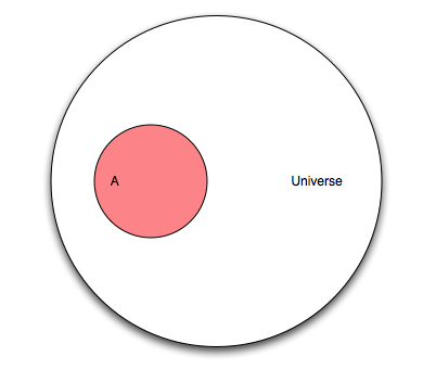
So what is the probability that a randomly chosen person has cancer? It is just the number of elements in \(A\) divided by the number of elements of \(U\) (the Universe). We denote the number of elements of \(A\) as \(|A|\), and read it the cardinality of \(A\). And define the probability of \(A\), \(P(A)\), as
Since \(A\) can have at most the same number of elements as \(U\), the probability \(P(A)\) can be at most one.
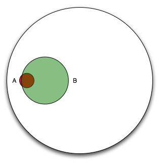
Good so far? Okay, let’s add another event. Let’s say there is a new screening test that is supposed to measure something. That test will be “positive” for some people, and “negative” for some other people. If we take the event B to mean “people for which the test is positive”. We can create another diagram:
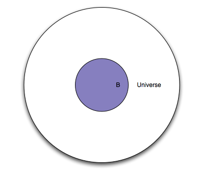
So what is the probability that the test will be “positive” for a randomly selected person? It would be the number of elements of \(B\) (cardinality of \(B\), or \(|B|\)) divided by the number of elements of \(U\), we call this \(P(B)\), the probability of event \(B\) occurring.
Note that so far, we have treated the two events in isolation. What happens if we put them together?
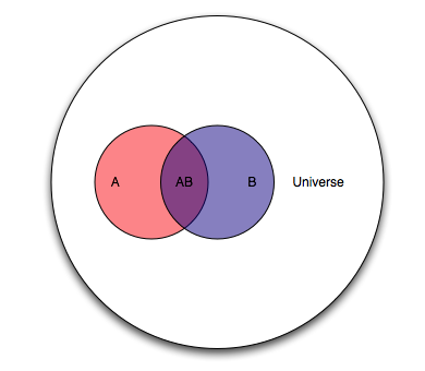
We can compute the probability of both events occurring (\(AB\) is a shorthand for \(A∩B\)) in the same way.
But this is where it starts to get interesting. What can we read from the diagram above?
We are dealing with an entire Universe (all people), the event \(A\) (people with cancer), and the event \(B\) (people for whom the test is positive). There is also an overlap now, namely the event \(AB\) which we can read as “people with cancer and with a positive test result”. There is also the event \(B - AB\) or “people without cancer and with a positive test result”, and the event \(A - AB\) or “people with cancer and with a negative test result”.
Now, the question we’d like answered is “given that the test is positive for a randomly selected individual, what is the probability that said individual has cancer?”. In terms of our Venn diagram, that translates to “given that we are in region \(B\), what is the probability that we are in region \(AB\)?” or stated another way “if we make region \(B\) our new Universe, what is the probability of \(A\)?”. The notation for this is \(P(A|B)\) and it is read “the probability of A given B”.
So what is it? Well, it should be
And if we divide both the numerator and the denominator by \(|U|\)
we can rewrite it using the previously derived equations as
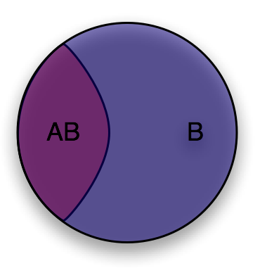
What we’ve effectively done is change the Universe from \(U\) (all people), to \(B\) (people for whom the test is positive), but we are still dealing with probabilities defined in \(U\).
Now let’s ask the converse question “given that a randomly selected individual has cancer (event \(A\)), what is the probability that the test is positive for that individual (event \(AB\))?”. It’s easy to see that it is
Now we have everything we need to derive Bayes' theorem, putting those two equations together we get
which is to say \(P(AB)\) is the same whether you’re looking at it from the point of view of \(A\) or \(B\), and finally
Which is Bayes' theorem. I have found that this Venn diagram method lets me re-derive Bayes' theorem at any time without needing to memorize it. It also makes it easier to apply it.
Example
Take the following example from Yudowsky:
1% of women at age forty who participate in routine screening have breast cancer. 80% of women with breast cancer will get positive mammograms. 9.6% of women without breast cancer will also get positive mammograms. A woman in this age group had a positive mammography in a routine screening. What is the probability that she actually has breast cancer?
First of all, let’s consider the women with cancer
Now add the women with positive mammograms, note that we need to cover 80% of the area of event \(A\) and 9.6% of the area outside of event \(A\).
It is clear from the diagram that if we restrict our universe to \(B\) (women with positive mammograms), only a small percentage actually have cancer. According to the article, most doctors guessed that the answer to the question was around 80%, which is clearly impossible looking at the diagram!
Note that the efficacy of the test is given from the context of \(A\), “80% of women with breast cancer will get positive mamograms”. This can be interpreted as “restricting the universe to just \(A\), what is the probability of \(B\)?” or in other words \(P(B|A)\).
Even without an exact Venn diagram, visualizing the diagram can help us apply Bayes' theorem:
-
1% of women in the group have breast cancer.
\[P(A) = 0.01\] -
80% of those women get a positive mammogram, and 9.6% of the women without breast cancer get a positive mammogram too.
\[P(B) = 0.8 P(A) + 0.096 (1 - P(A)) \\ P(B) = 0.008 + 0.09504 \\ P(B) = 0.10304\] -
we can get \(P(B|A)\) straight from the problem statement, remember 80% of women with breast cancer get a positive mammogram.
\[P(B|A) = 0.8\]
Now let’s plug those values into Bayes' theorem
which is 0.0776 or about a 7.8% chance of actually having breast cancer given a positive mammogram.